Tutor Joe's Free Online Web Development Bootcamp Tamil
Creating Cards in CSS
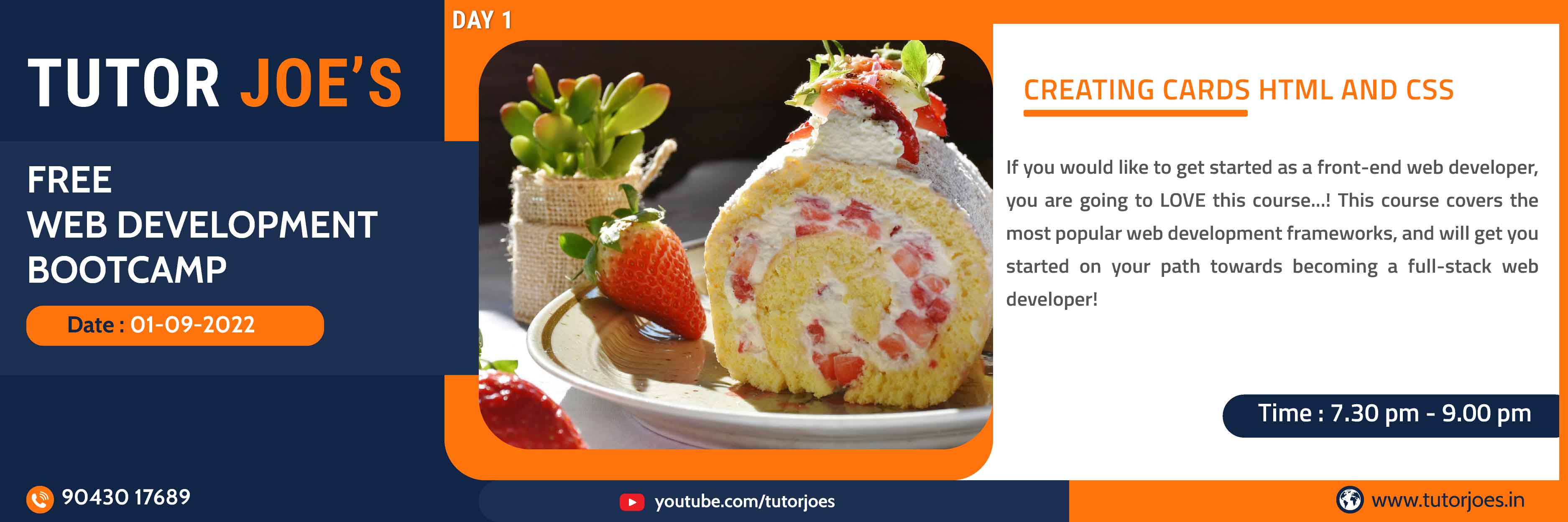
Cards can be a convenient means of displaying content that includes various objects, such as the title, image, buttons, icons, etc. Designed adobt to your contents, the blocks or cards can include any type of custom elements.This article will be exclusively about CSS cards
View Source CodeDynamic Loader in CSS
Loaders can be used to show the loading state in your projects. They're built only with HTML and CSS, that means you don't need any JavaScript to create them. You will, however, need some custom JavaScript to toggle their visibility. Their appearance, alignment, and sizing can be easily customized with our amazing CSS Properties.
View Source CodeAwesome flip cards in CSS
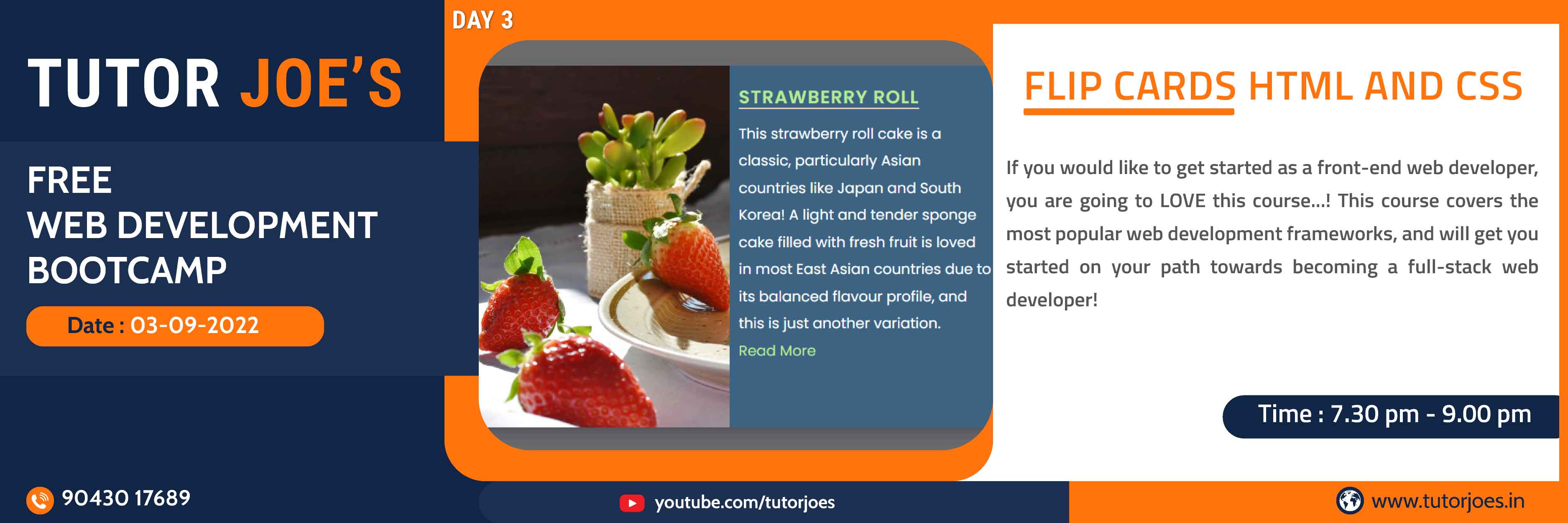
In this tutorial, we're going to build a flip card grid which solves that problem with some CSS basics.Flip Cards are durable cards, usually created as sets, which convey printed information in a simple and convenient format. Used most often for reference or instructional purposes, flip card sets may consist of just a few cards or they may compile a thick deck.
View Source CodeResponsive Navigation Bar in CSS
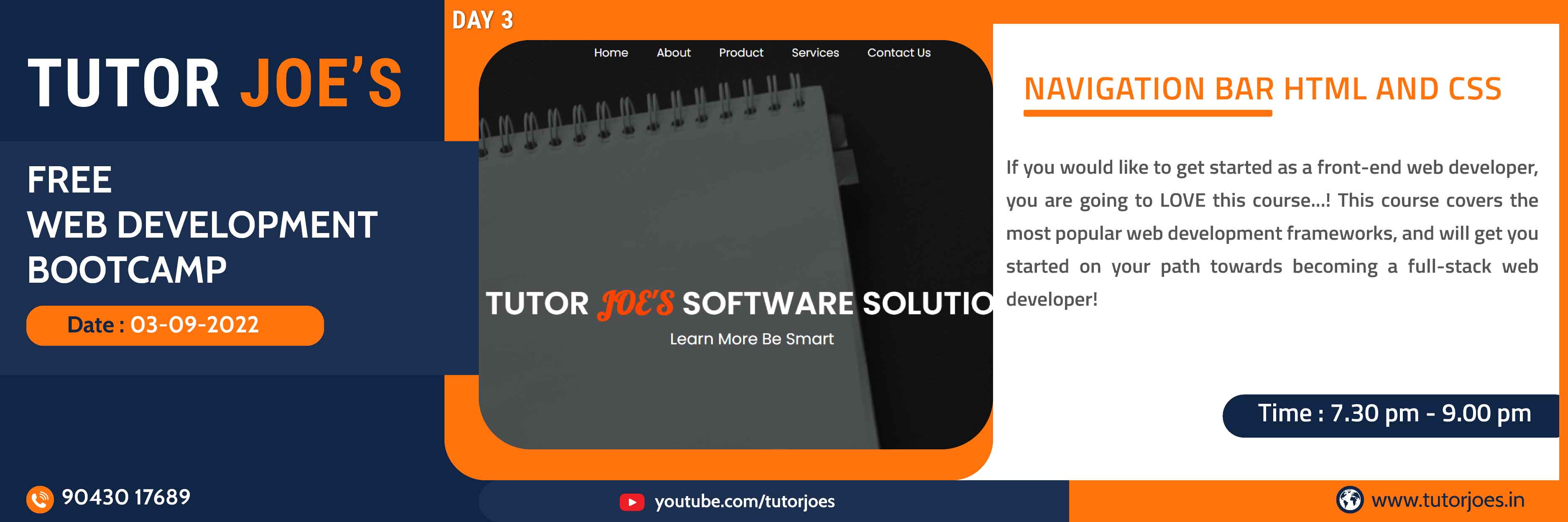
In this post,we'll see how you can create a custom sticky navbar with great functionality, using only CSS to create it. A navigation bar (also called a Navbar) is a user interface element within a webpage that contains links to other sections of the website. In most cases, the navigation bar is part of the main website template, which means it is displayed on most, if not all, of the pages within the website.
View Source CodeStylish Login Form in HTML & CSS
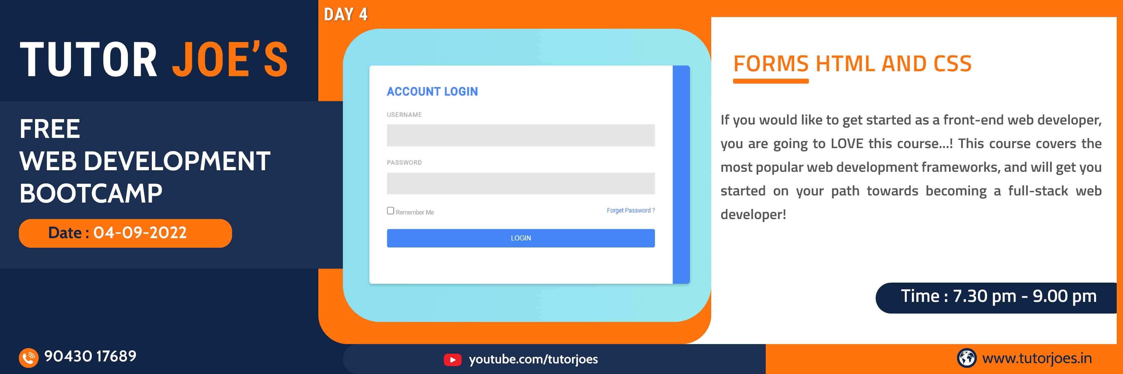
This tutorial covers the creation and styling of a web form that requests various data from the user.The form will use text fields, checkboxes,drop-down selections, a text area, and submit and reset buttons. You will create and style this form and its elements by resetting the styles with the appearance property, setting up your own consistent style for the form, adding placeholder answers for the text fields, and customizing the radio buttons and checkboxes with various pseudo-classes and pseudo-elements.
View Source CodeAnimated Sticky Notes in CSS
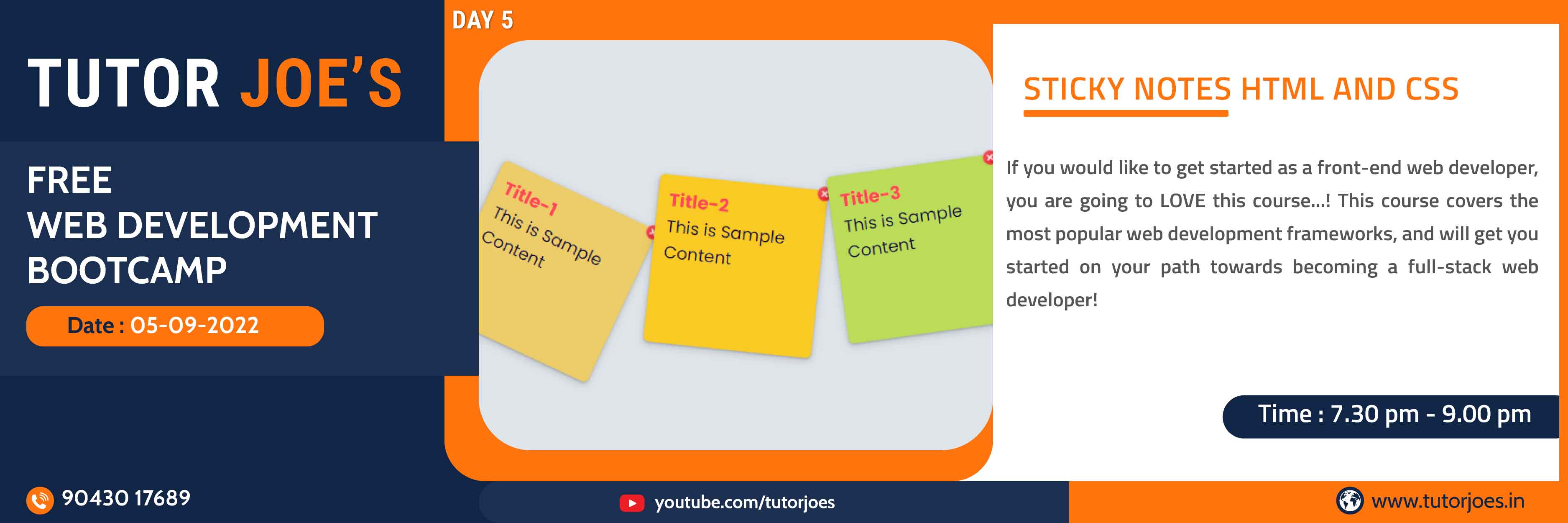
In this post, you'll learn how to make a sticky notes for your own site. Sticky positioning is a hybrid of relative and fixed positioning. The element is treated as relative positioned until it crosses a specified threshold, at which point it is treated as fixed positioned.
View Source CodeClassic Single Page Template in CSS
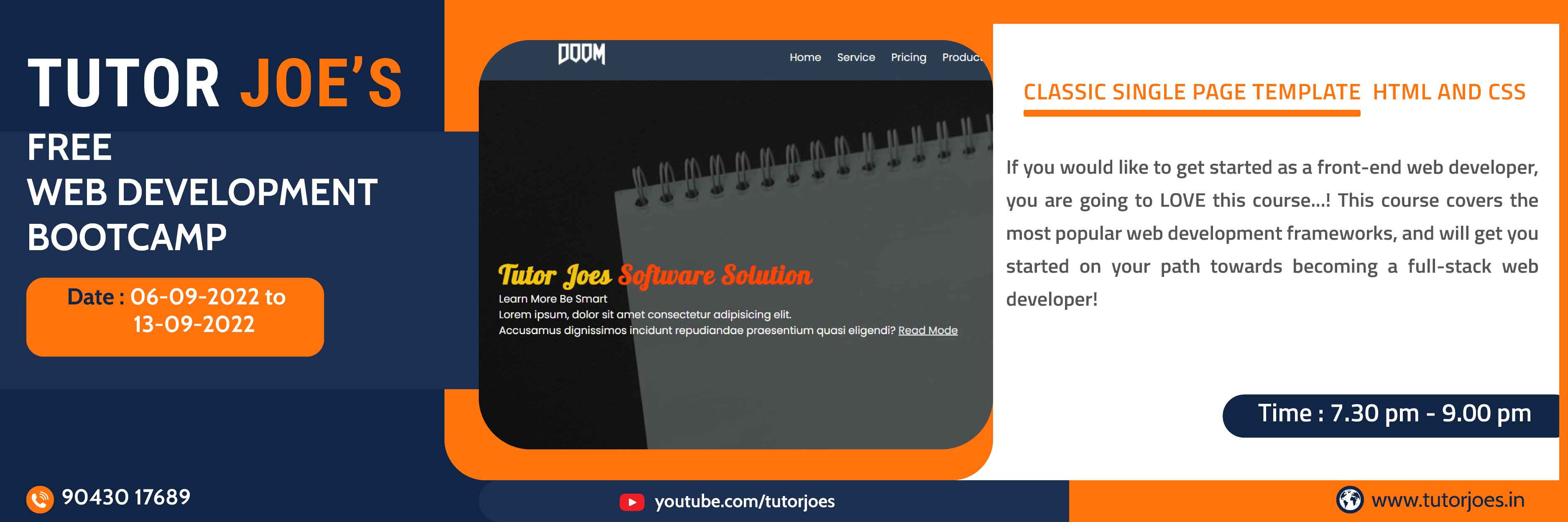
In this post,we'll see how you can create a single page template. OnePage is a multi purpose css one page website template. It's a modern, clean and creative template with lots of options available for you to create any kind of website, whether it is corporate, creative agency start up business, digital studios or any other business that needs a creative one page website.
View Source CodeCreating Responsive Navbar in CSS
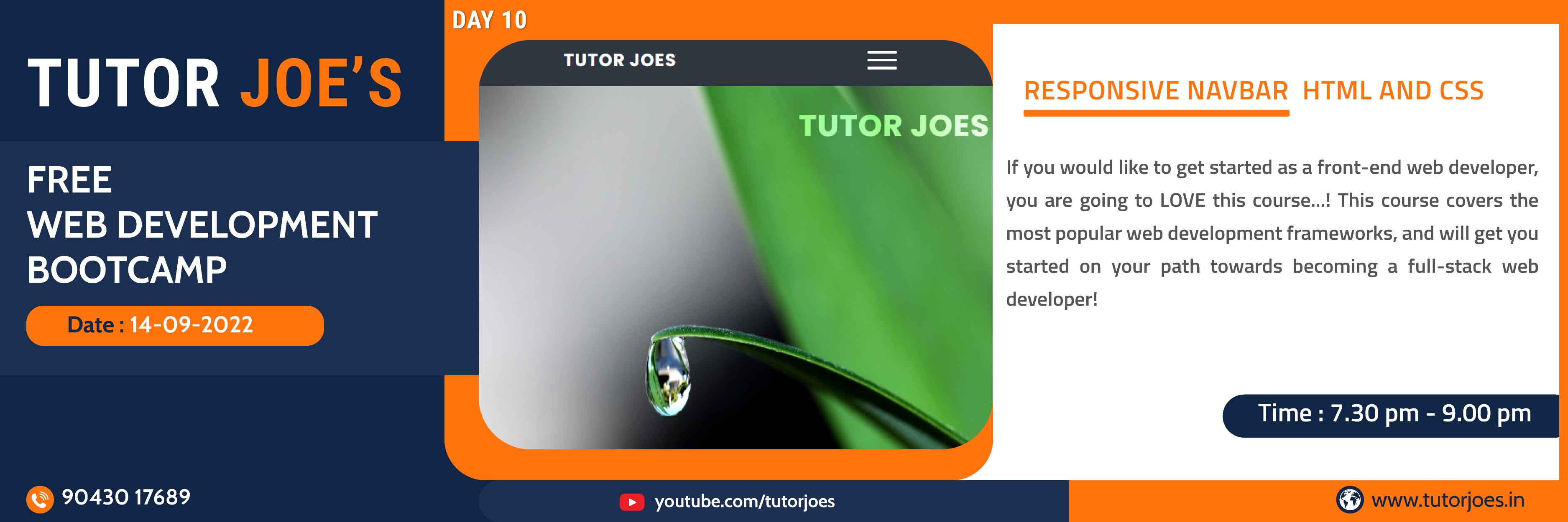
In this tutorial, we'll look into how to create a responsive navigation bar.The responsive navigation bar is a UI element in the website which contains links to other sections of the website.
View Source CodeProfile Cards in CSS
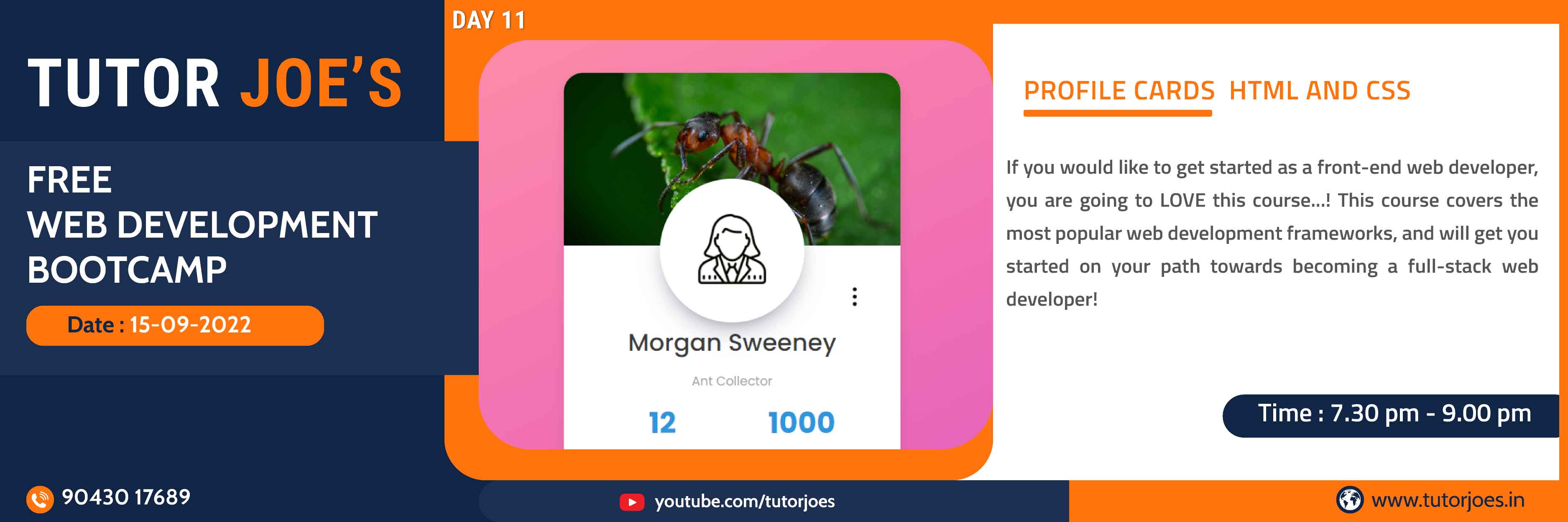
In this post,we'll see how you can create a Profile Cards. A card is a flexible and extensible content container. It includes options for headers and footers, a wide variety of content, contextual background colors, and powerful display options.
View Source CodeCreating Stylish Login Form in CSS
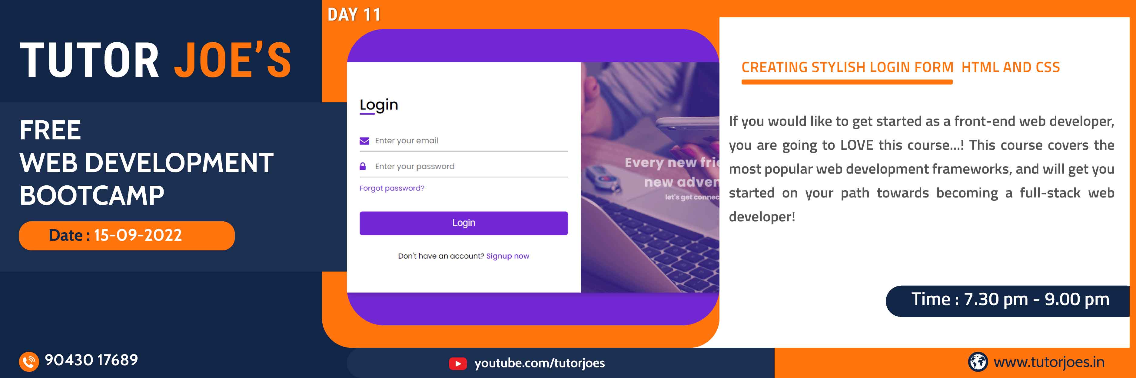
In this tutorial we will be creating a login form . A login form utilizes the credentials of a user, in order to authenticate their access. It generally consists of the typical username or email and password. But more fields can be added to improve the site's security.
View Source CodeResponsive Table Design in CSS
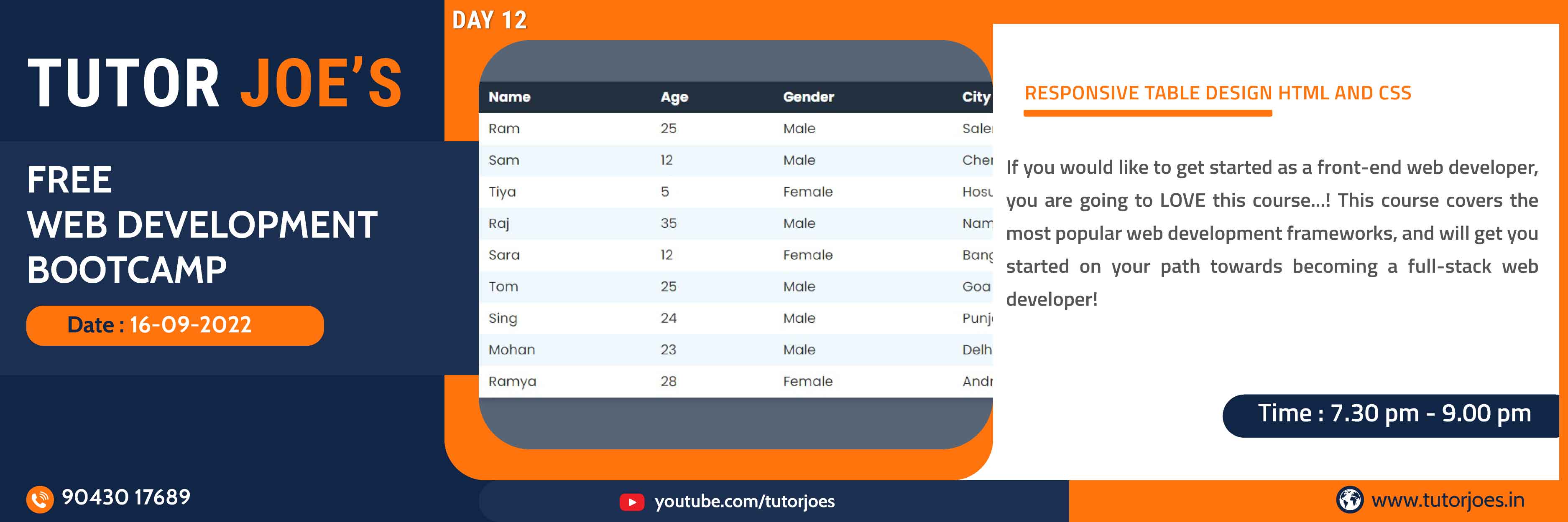
Responsive web design rescales itself depending on the device. The primary reason to make an element or container responsive is to add to the user experience. In this shot, we'll discuss using CSS to make a table responsive.
View Source CodeStylish Button in CSS
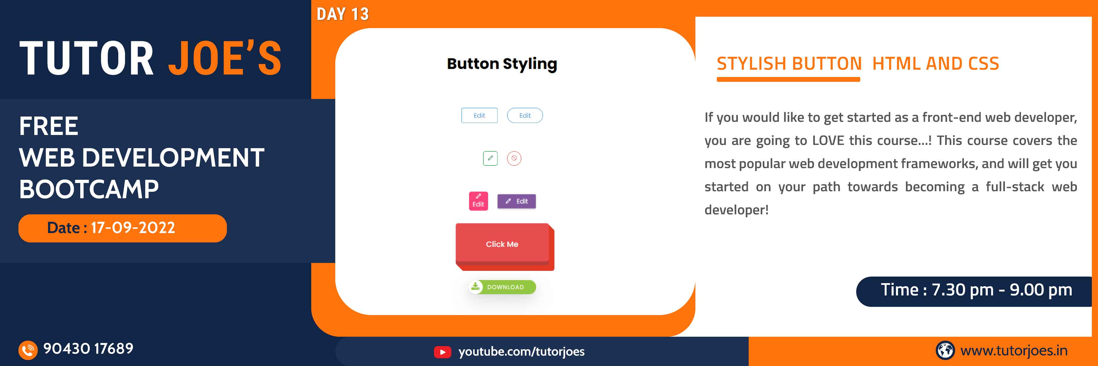
In this tutorial we will be creating a Stylish Button. A type that applies standard interaction behavior and a custom appearance to all buttons within a view hierarchy.You can manipulate the colors, text sizes, padding, and even change styling properties when buttons enter different states.
View Source CodeAnimated Navbar in CSS
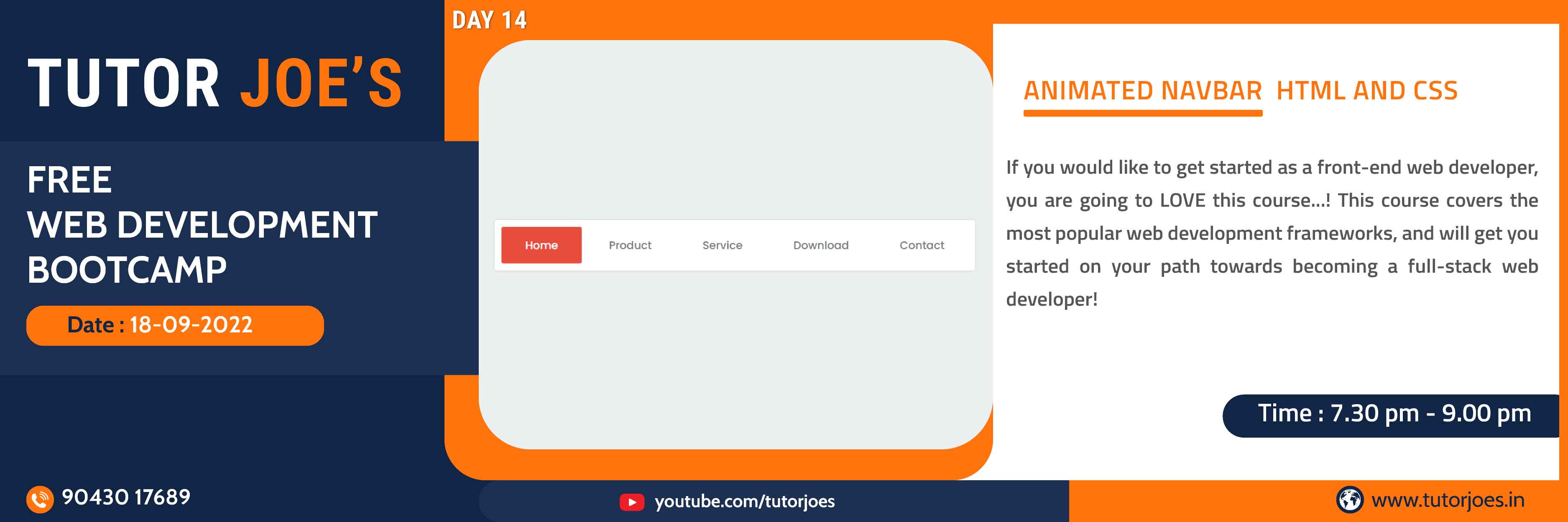
In this tutorial we will be creating a Animated Navbar. A Navigation bar or navigation system comes under GUI that helps the visitors in accessing information. It is the UI element on a webpage that includes links for the other sections of the website. A navigation bar is mostly displayed on the top of the page in the form of a horizontal list of links.
View Source CodeCreating Modal in CSS
In this tutorial we will be creating a modal. A modal is a window that appears on top of a parent screen. It's called 'modal' because it creates a mode that disables the parent screen but keeps it visible. Users must interact with the modal to return to the main screen. Designers use modal windows to grab users' attention
View Source CodeResponsive Navbar Design Using Pure HTML CSS
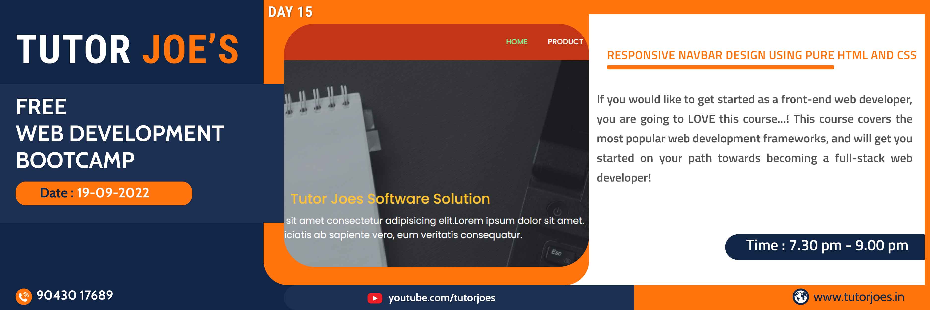
In this tutorial we will be creating a Responsive Navbar Design Using Pure. The responsive navigation bar is a UI element in the website which contains links to other sections of the website.
View Source CodeAnimation Properties Examples Part-1 in HTML CSS
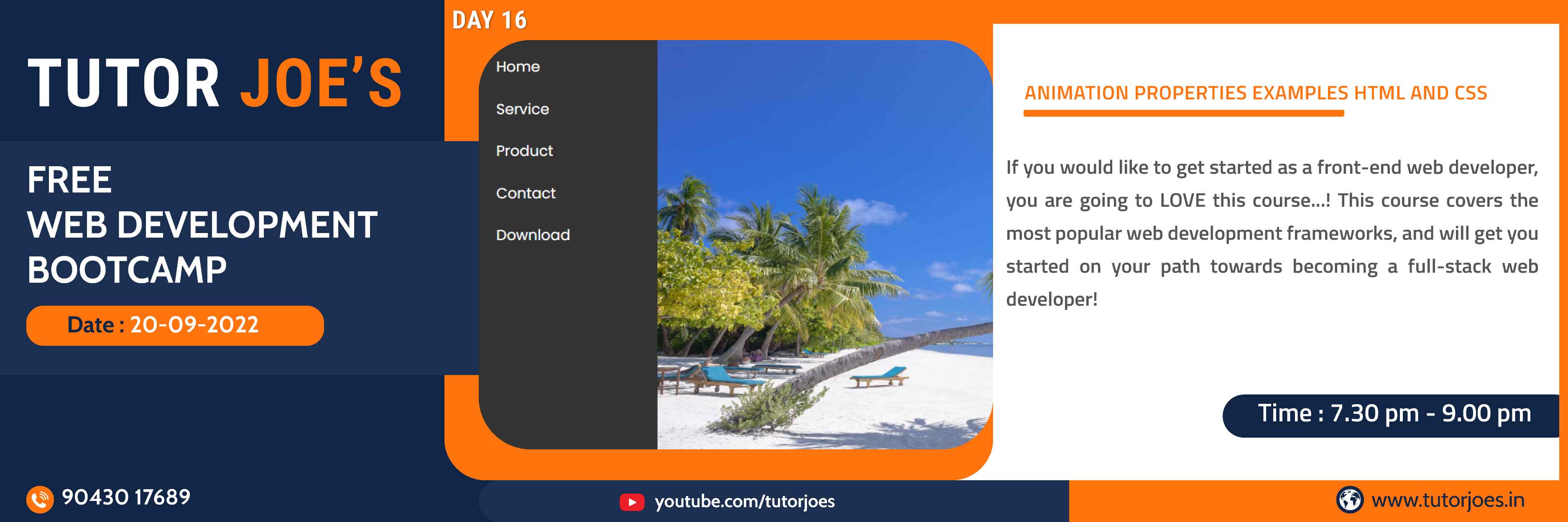
In this tutorial we will be creating a Animation Properties. The animation shorthand CSS property applies an animation between styles. A property animation changes a property's (a field in an object) value over a specified length of time. To animate something, you specify the object property that you want to animate, such as an object's position on the screen, how long you want to animate it for, and what values you want to animate between
View Source CodeAnimation Properties Examples Part-2 in HTML CSS
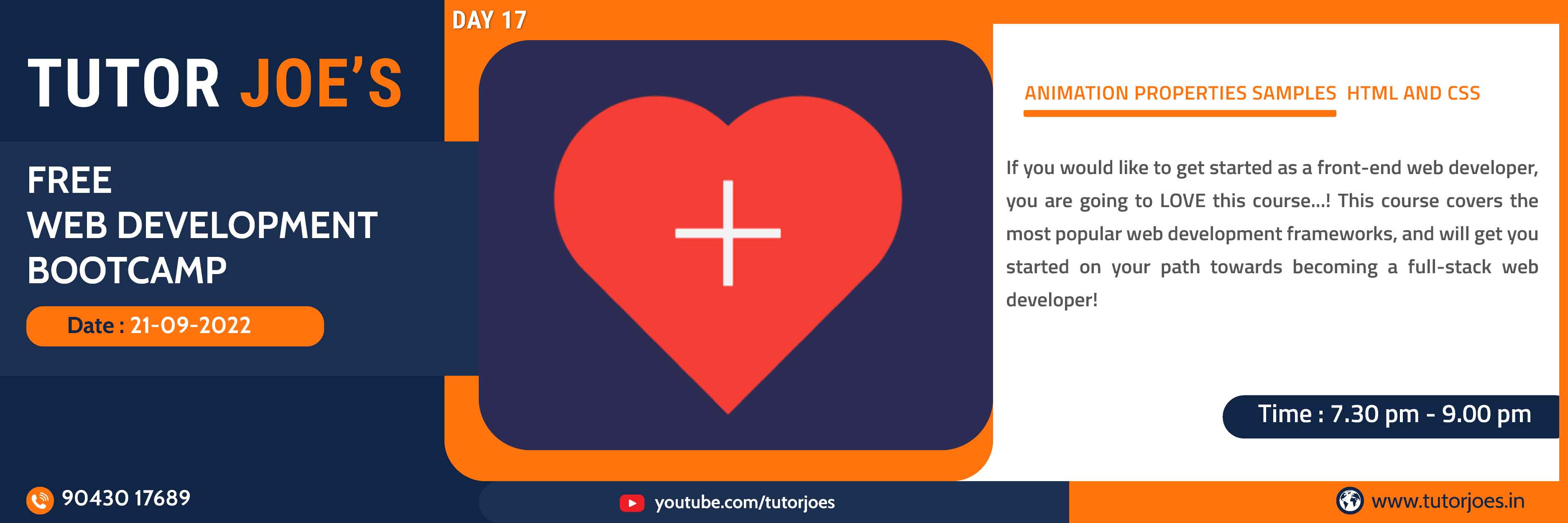
In this tutorial we will be creating a Animation Properties. The animation shorthand CSS property applies an animation between styles. A property animation changes a property's (a field in an object) value over a specified length of time. To animate something, you specify the object property that you want to animate, such as an object's position on the screen, how long you want to animate it for, and what values you want to animate between
View Source CodeAnimated Windows Spinner in HTML CSS
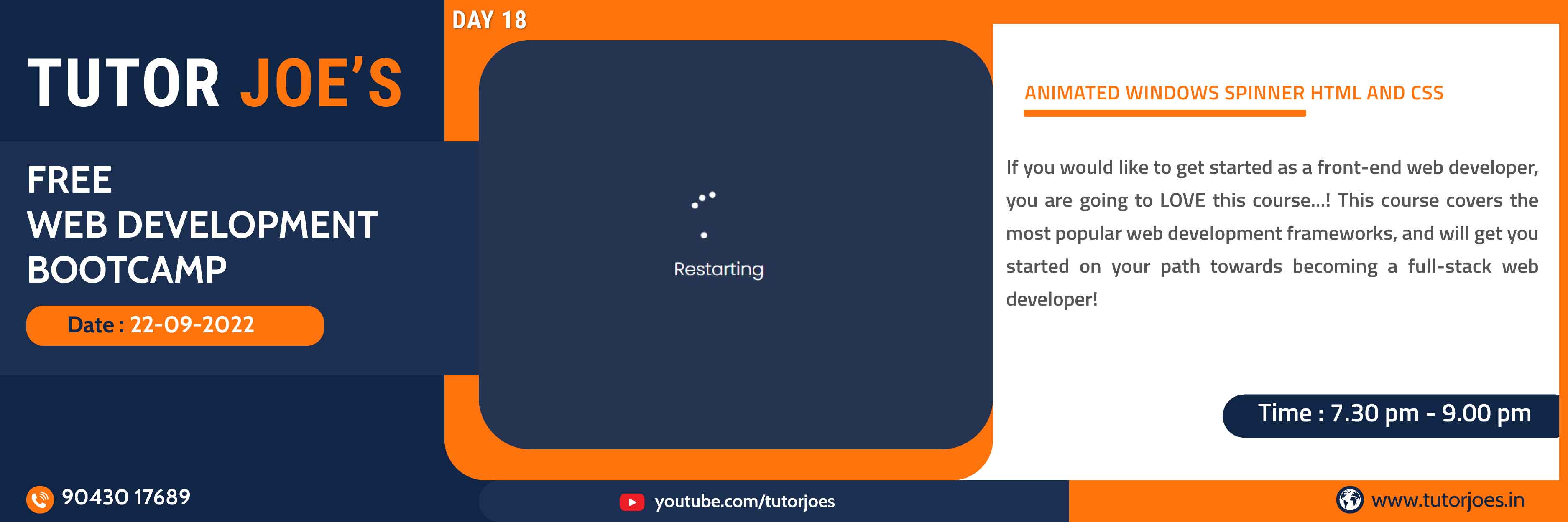
In this tutorial we will be creating a Animated Windows Spinner. The mechanism behind the spinners is relatively simple. As any spinning apparatus, fidget spinners rotate around a central axis, formed by two rings. By using a ball bearing mechanism instead of simple sliding between the rings, friction may be reduced significantly during rotation.
View Source CodeHorizontal Navigation bar using in HTML CSS
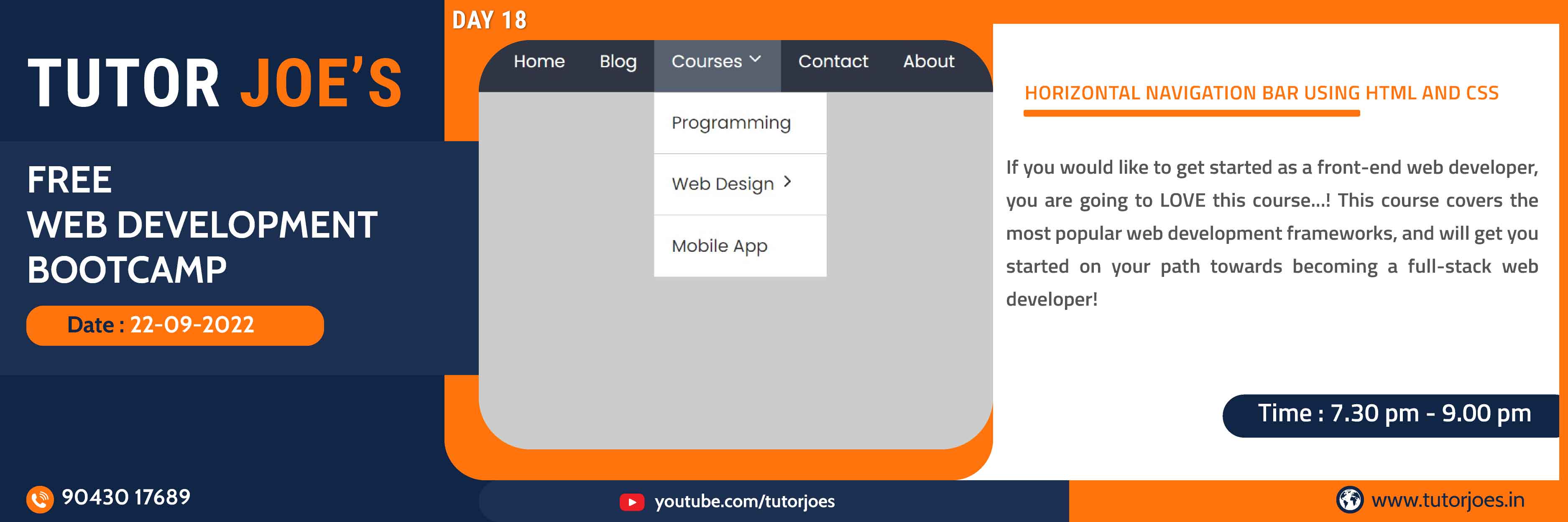
In this tutorial we will be creating a Horizontal Navigation bar. A horizontal website navigation bar is a list of links at the top of each page. It may be above, below, to the left or to the right of the header or logo, but it is always placed before the main content of the page and is consistent on every page.
View Source CodeCSS Units for Responsive Designs
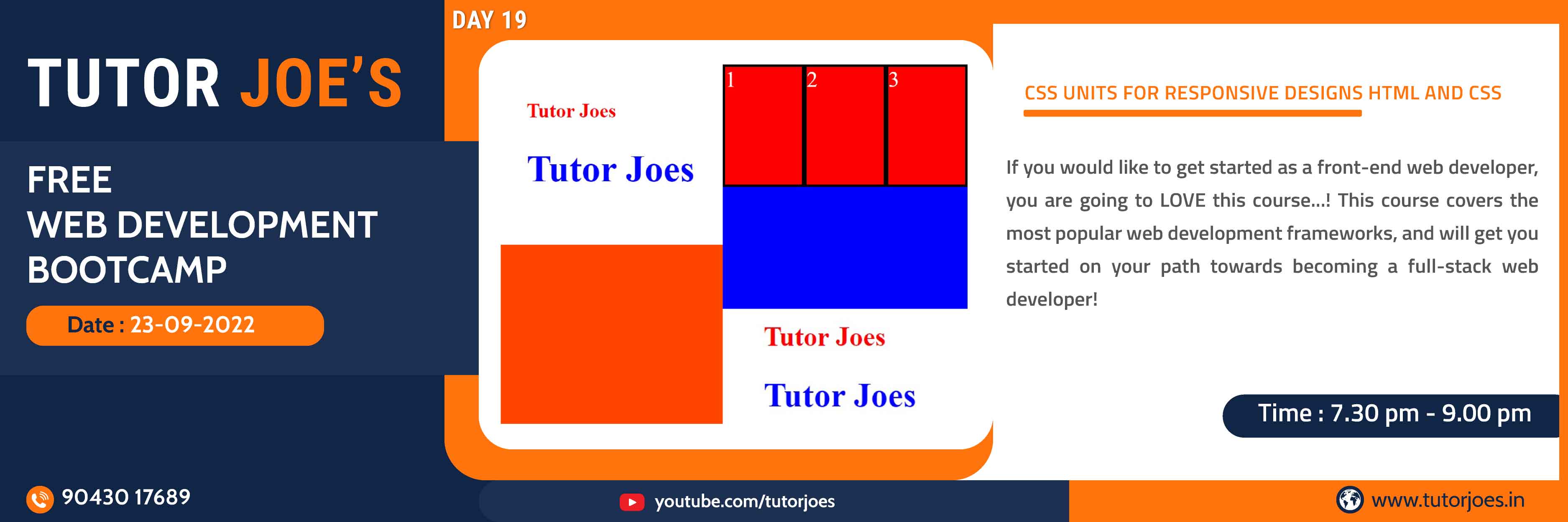
Every property like margin, padding, height, width, font-size, etc in CSS that has some dimensions or length needs a unit. The most common CSS Unit we shall be using our website pages. we want our elements to be responsive we shall use CSS units like percentage, em, or rem. We shall be studying each of these units in detail in our tutorial.
View Source CodeResponsive Accordion Animation in CSS
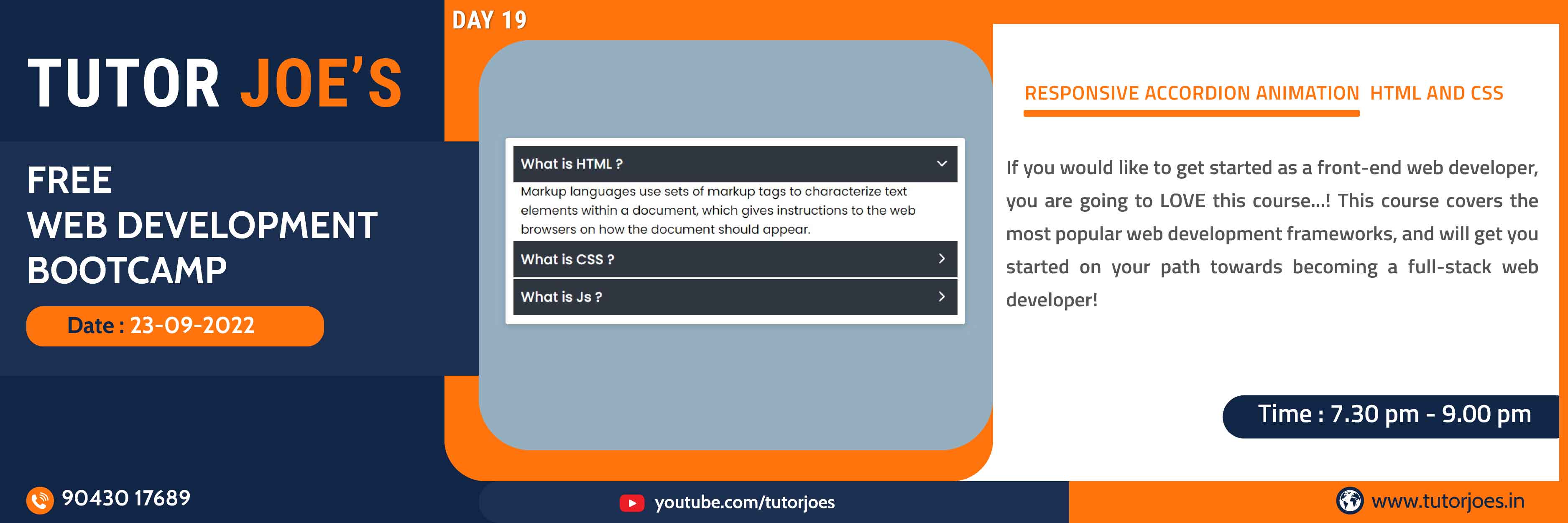
You can create a CSS accordion and make use of the benefits, in this article we will be exploring just that.Accordions are a great way to display information in a certain section with a heading and save space. Usually, these accordions will collapse in some way, so another can be opened.
View Source CodeFlip Over Card Design in CSS
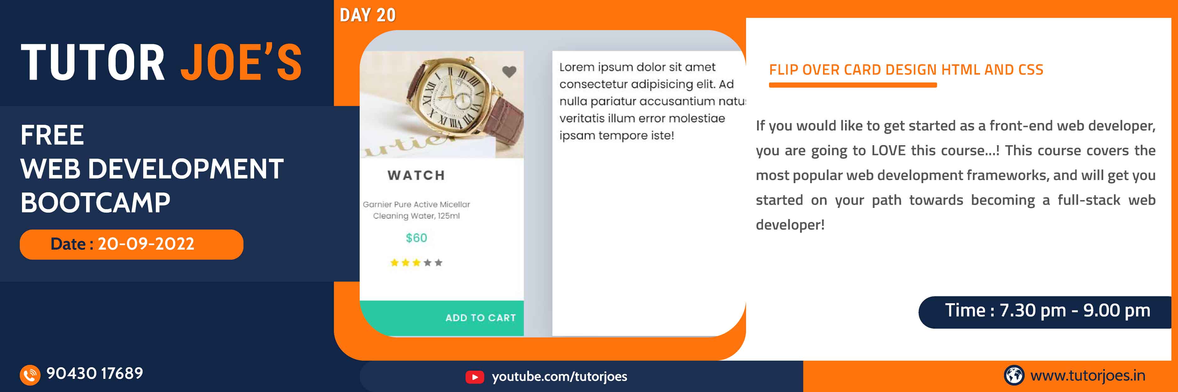
In this tutorial we will be creating a Flip Over Cards. Flip Over Cards are durable cards, usually created as sets, which convey printed information in a simple and convenient format. Used most often for reference or instructional purposes,flip card sets may consist of just a few cards or they may compile a thick deck.
View Source CodeWeb Development
Learn All in Tamil © Designed & Developed By Tutor Joes | Privacy Policy | Terms & Conditions